


So what is responsive web design, really?
Responsive website design refers to how a website looks across all devices - from your computer monitor sitting on your work desk (a desktop computer) to the iPhone you might be reading this message on (a mobile device). When a website adheres to proper responsive design principles, the website looks good on any of these devices. But because beauty is more than skin deep, having a responsive website also means that people have a pleasant experience with the website. It shouldn’t matter whether they use a mouse and keyboard or their fingers.
-2.jpg)
Has this ever happened to you? You were planning on going out to eat with a few of your friends. Using your phone, you search for the restaurant where you plan to eat because you want to see the menu. You find the restaurant, go to their website, and you’re instantly frustrated at the how hard it is to achieve your goal. You just wanted to see the menu.
But you can’t find the menu. You have to pinch-and-zoom to look for the link. You try and click the link, but accidentally click on the gift cards page. You go back and finally click the right link. You get taken to another website. Ugh! You give up and will just decide on what to eat when you get there. Hopefully your friends don’t get on to you for taking too long to decide.
You’re not alone here. This scenario happens to a lot of people. In fact, almost half of all individuals have a poor experience using websites on their phones. Responsive website design is becoming such an important trend because responsible web designers don’t want people to be frustrated.
So then why is responsive website design important?
In plastic surgery alone, we saw 57% of users (current and potential future patients) come to our websites last year from a phone or tablet. That’s more than half!
Websites are extensions of the brands they represent, regardless of the device they are viewed on. It makes a practice look bad when their website doesn’t work properly, or when it works on desktop but not on mobile or tablet. With more than half of your traffic coming from mobile devices, you must appeal to this group of people or run the risk of losing consultation requests!
What’s more - Google announced a while back that after April 21st, 2015, they would begin penalizing websites that are not mobile-friendly by suppressing their search rankings for mobile search results pages. This means that half the work your “SEO company” is doing becomes worthless if you don’t have a mobile-friendly website. Non-mobile friendly websites won’t even rank for the search phrases that they might enjoy strong performance for on desktop.
How can I tell if my practice’s website makes the cut?
There are two easy tests we like to recommend.
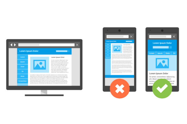
1 - Open your homepage, fullscreen. Now click and drag the edge of your browser window to resize it. Make it as narrow as possible. Then try and use your website. Did you have to scroll horizontally? If so, your website failed. Try the same thing with a few other pages - true responsive website design means every page of your website is mobile-friendly.
2 - Head on over to Google’s tool here.
Enter the web address for a few of your website’s pages. If you see nothing but green responses, you’re good to go!
What happens if my website is not responsive?
Don’t fret. There are many companies out there that can help protect your brand’s reputation on the mobile web. Here are a few questions you can ask when choosing a mobile web designer, based on Google’s recommendations:
- Do they design mobile websites with the same url as the desktop one? “Mobile.nytimes.com” is not the same as “nytimes.com”. Having different urls is not a good thing; true responsive design means having one URL.
- Do they make sure users don’t have to pinch-and-zoom or scroll horizontally to use the page?
- Do they make text readable without having to zoom in?
- Do they make links easy to click on the mobile version?
- Do they make the same content on desktop available to mobile users? Legitimate responsive design has the same content on both the mobile version and desktop version.
- Does every page follow the guidelines above?
Ask your web designer if they are using a plugin to “achieve” these results. If they say yes, did they charge you for the upgrade? Most plugins are free, so you might have been ripped-off.
Responsive website design is one of the hottest trends in internet marketing, so it’s common you’ll keep hearing web companies tout about their responsive capabilities. It’s not hoopla after all. Responsive website design does matter. Having a responsive website protects your practice from losing patients who now use their phone rather than a computer to come to your website.